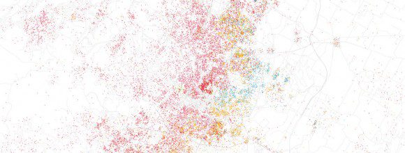
Paint by number is a pretty easy way to teach children the skill of following directions and staying within the boundaries. But could it be that cities are following suit? The image above is a map of Austin detailing the racial integration in different cities. Similar maps of New York, Los Angeles, San Antonio and Washington DC can be found here.
(Color key: Pink = White; Blue = Black; Orange = Hispanic; Green = Asian)
Not mind boggling enough? Check out this map of Detroit. Can you find 8 Mile?

Detroit
What thoughts and emotions do these images evoke within you?
Here in the United States, the primary analogy describing our culture is a melting pot. In Canada, the common analogy is likening the culture to a mosaic. Each illustration hold beauty and uniqueness, but each has its own drawbacks. In the melting pot analogy, you find a tremendous amount of commonality and shared values, but the uniqueness of one’s culture can easily be diluted and replaced by a homogeneous expression of life. In the mosaic analogy, the emphasis is placed on the uniqueness of one’s culture by allowing room for each cultural expression to live, breathe and exist side-by-side with others. The drawback in this model is a tremendously easy space to foster segregation and indifference through comfort by remaining in one’s cultural bubble.
The question for us, Vox Veniae, is how can we be a community that holds strong to our uniqueness and diversity as a community, while bridging cultural and socio-economic divides?
[Photo by Eric Fischer @ Flickr]
[via Fast Company]